kontakt@para-buch.pl
tel. Zofia 607 111 365
tel. Katarzyna 608 304 344
ul. Jaworzyńska 8 lok 7
00-634 Warsaw
kontakt@para-buch.pl
tel. Zofia 607 111 365
tel. Katarzyna 608 304 344
ul. Jaworzyńska 8 lok 7
00-634 Warsaw
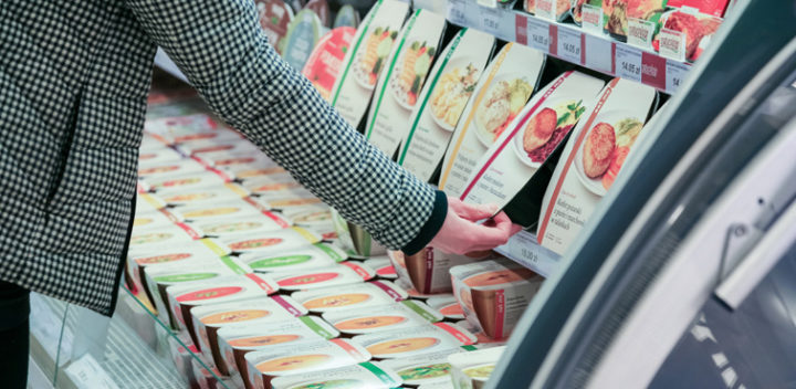
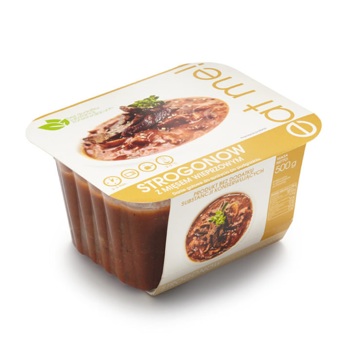
Eat me is a manufacturer of ready-made soups and lunch dishes active on the Polish market for couple of years. Our task was to refresh the graphic design of their product packaging along with revamping the brand’s visual identity maintaining key features of the old packaging.
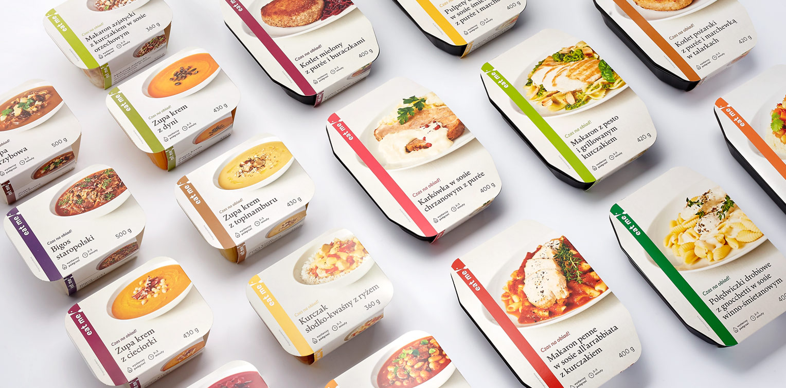
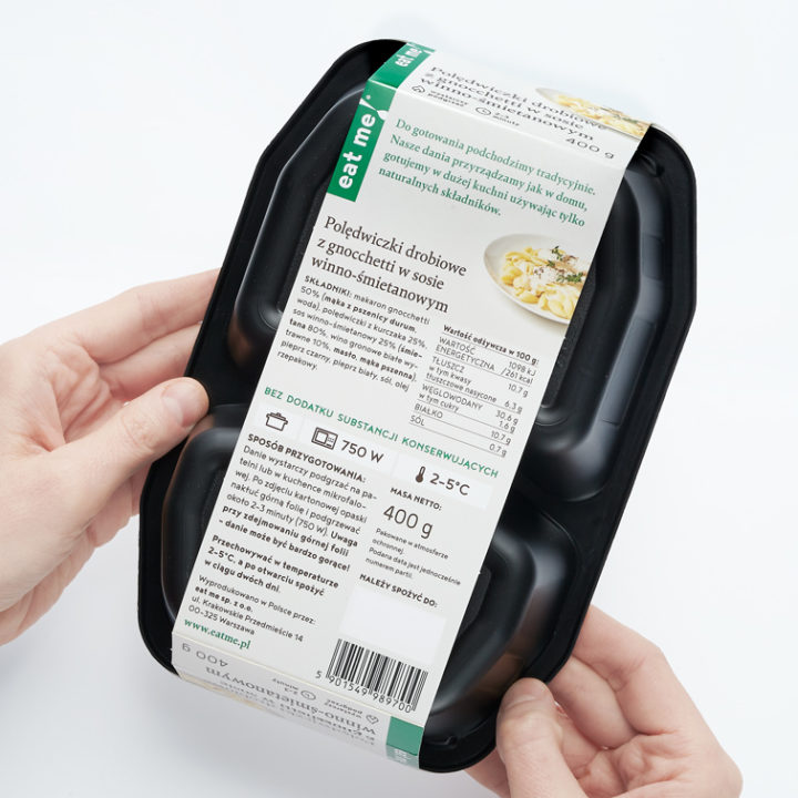
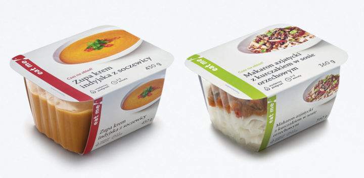
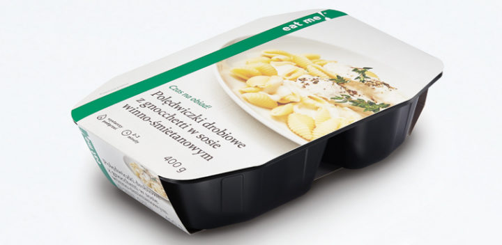
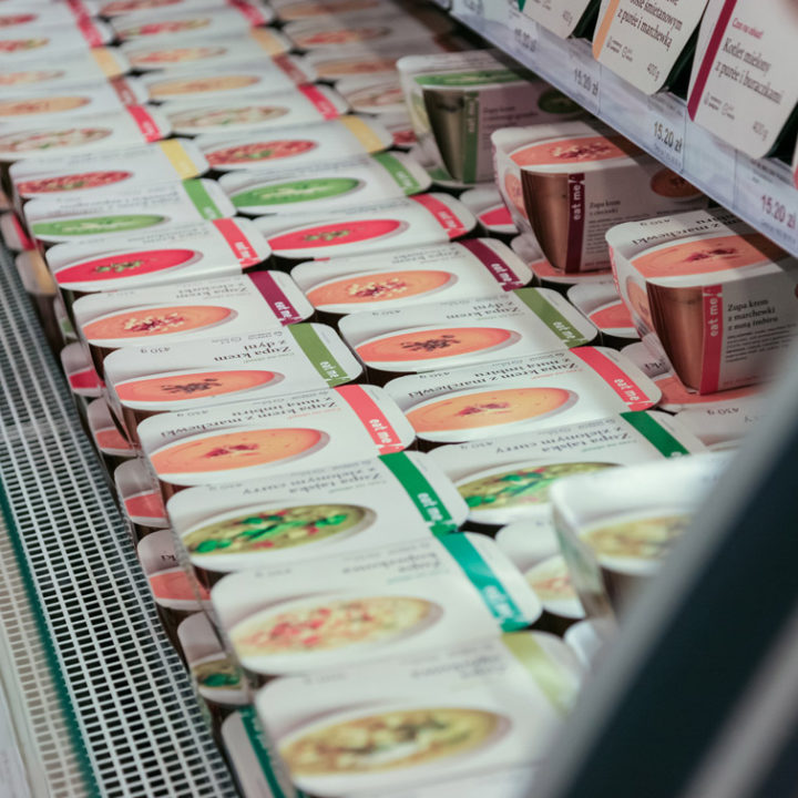
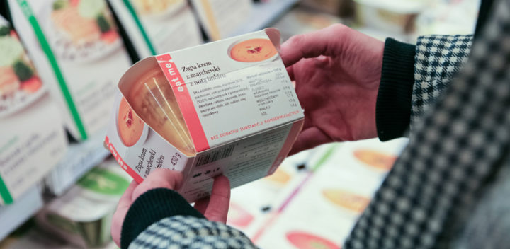
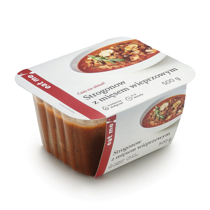
The new packaging is responsible for catching the attention of the client therefore the dish is its key feature and is presented on the minimalistic tableware placed on a bright, neutral tablecloth. For this purpose, each of the dishes was professionally stylized and photographed. Additional identification feature of each dish is a “taste stripe” encircling the packaging and providing graphical identification of eat me. The colors of the stripes match the photographed dishes marking out each, often similar, dish. What’s more, each dish has a “taste stripe” around the packaging which provides graphic identification of eat me. The colour of the stripe matches the photographed dish and singles it out from the other, sometimes similar, dishes.
The eat me dishes are produced in traditional way, without preservatives added. Therefore, we wanted to underline “homemade” quality of the brand. The company logo gained a new softer look and instead of the exclamation mark it is accompanied by a spoon. A background for the dish is a bright clear, linen tablecloth and the colours used match those of natural food palette.